Project 3: Typeface
Characteristics,
Personality,
Rhythm & Flow

Research
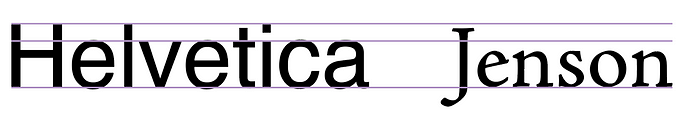
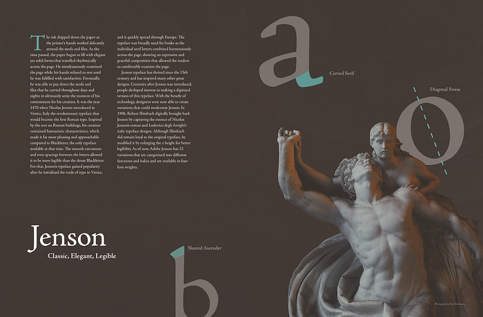
I began doing some research for the typeface Jenson. The typeface was created by Nicolas Jenson in 1470. Although there’s not much information about Nicolas Jenson, it was known that he spent his years in Venice, Italy while working. Jenson typeface is one of the earliest typefaces created after Blackletter. Unlike Blackletter, which was dense and hard to read, Jenson was humanistic, legible, and a good fit for books.


Characteristics

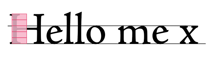
- Small x-height (3/5 of cap height)
- Diagonal stress
- Calligraphic serif
- Inspired by hand written style (organic and dynamic)
- Bracketed serif on lower cases
- Double story a and g
- Kerning
Although typically bigger x heights are better for legibility, the slated serif allows the typeface to be legible and expressive.
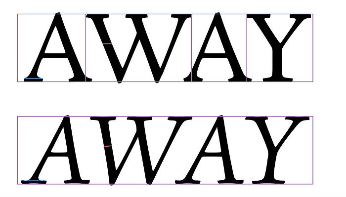
There’s an italic version of Adobe Jenson, which was based on the typeface created by Ludovico Vicentino degli Arrighi. There are some visible font weight changes between the two.
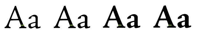
The typeface is also divided into four different font weights: light, regular, semi-bold, and bold. However, the changes aren’t drastic enough to put a huge emphasis.
Adjectives
Legible, revolutionary, classic, elegant, humanistic, expressive
Since Jenson is one of the earliest legible typefaces and the first Roman type, it brought a huge shift from Blackletter. It spread across Europe pretty rapidly and was widely used for books and bibles. In order for the digitalized typeface to remain loyal to the original Jenson, it has calligraphic features that resembles a hand written style, which contribute to making the typeface seem expressive, humanistic, and classic.
Part II
Font Pairing
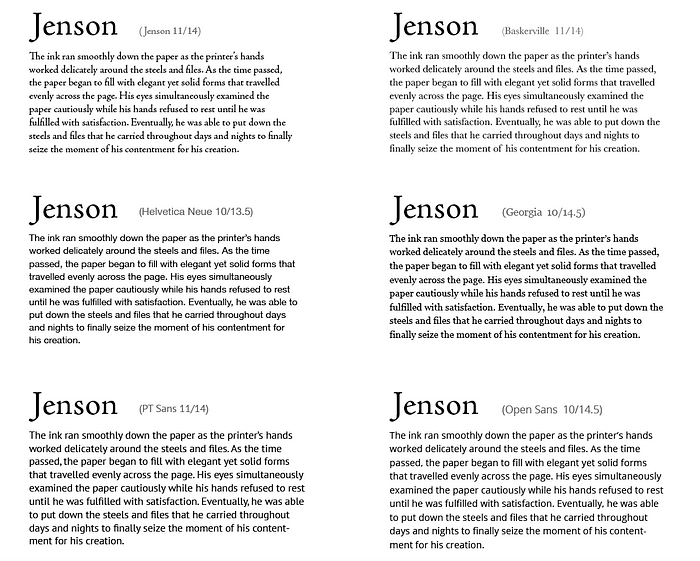
Before I started thinking about layout, I looked at different font pairings to see which font goes well with Jenson. During this process, I realized that I generally liked pairing Jenson with a serif font better than a san serif, since the pair provided more of a classic feel to it. I decided to choose Baskerville for doing some of the layout exercises.
Layout
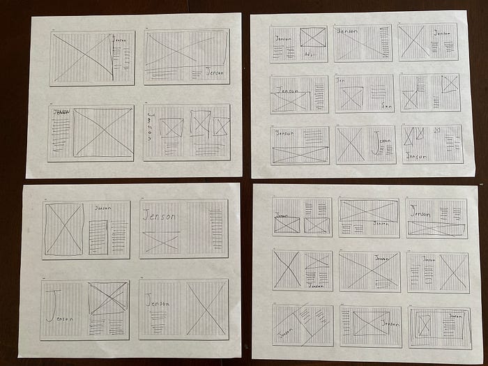
I then moved on to doing some quick thumbnail sketches that could help me develop my ideas. Although these were far away from being refined, they did help my mind to get in the right place for me to continue exploring.
From there, I began working in InDesign to do some more quick explorations of text compositions. At this stage, I was slightly confused on how I would take it to the next step or even come up with a decent layout. So I decided to test out some of these explorations with images, which was probably not the best idea.


From the beginning, I knew that I didn’t want to use vector letter illustrations since those would look too modern. So I gathered some images that provided the classic European feeling; I wanted the images to be grand.
Instead of putting images directly in InDesign, I worked with figma since I was slightly scared of InDesign. Again, all of these need serious refinement work, and these were just for me to visualize the overall feeling. Through this exercise, I began to develop ideas on how I was going to crop and resize the images.
Meeting with Vicki
I had a meeting with Vicki as a group in Monday to talk about my process. During the meeting, she suggested that typeface letter can be used as the guidelines for our text layout. Some of the specific feedback that I got were
- Baskerville is an interesting choice; it works?
- Make sure the images don’t override the context and the typeface
By looking at Grace’s and Michael’s process, I realized that I was just rushing through a lot of the exercises and I wasn’t really putting enough effort in.
Font pairing again
I decided to look at fonts one more time, in order to see what kind of fonts I can successfully use. From here, I narrowed down to these fonts that matched the mood.
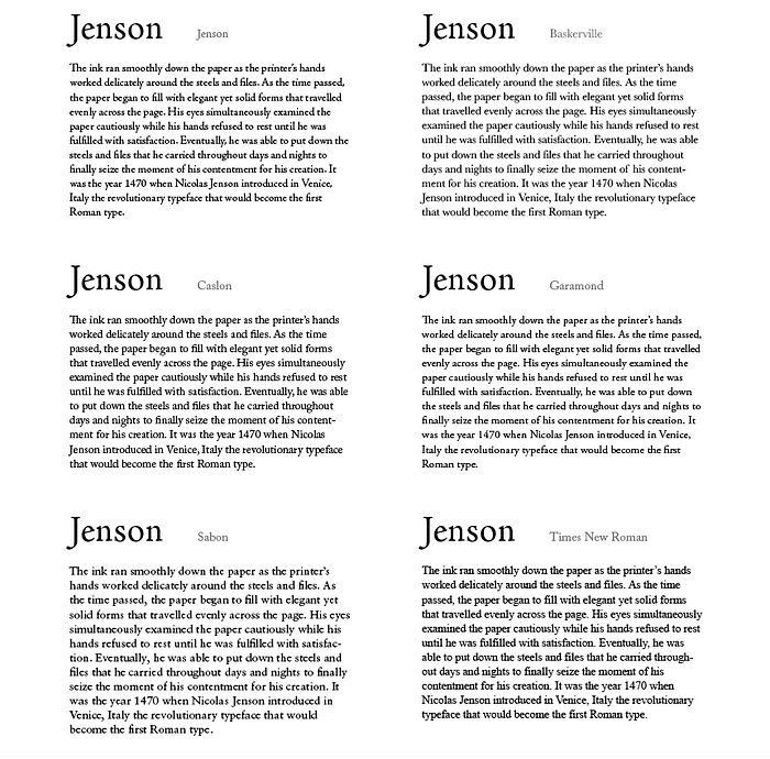
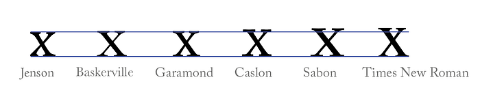
Although Times New Roman is a very readable typeface, it didn’t have much personality. So I decided to use Sabon at least for this stage of the spreads.


After meeting with Vicki, I experimented with composition using the letter compositions. These were some of the more successful ones and were used in the spreads.


Feedback
- Width of the columns should be the same
- Actually liked Baskerville
- Experiment more with the composition and color
- When showing the letter characteristics, write descriptions as well
- Prefers the regular Jenson more than italicized Jenson
- Move forward with the third and last spreads
- Use optical kerning if the font size is large
Iteration 2
After getting the feedback, I narrowed down the pictures and used the ones that she suggested that I should use. I also went back to using Baskerville for the body. For both types of spreads, I wanted to make the colors less harsh for more peaceful and calm feelings. It felt like Jenson should be more subtle.
Unfortunately, I felt extremely stuck after creating these two compositions and couldn’t come up with more.


Feedback form Vicki
- Likes that color scheme of both spreads but could add a pop color to the left one (like brown or orange)
- The transparent letters on the right don’t add much; if I’m going to use those, find a way to put meaning into them
- The rag on the left is slightly better
- Choose one and refine; leaning more towards the left one
- Make sure nothing is in the middle folding area
Overall, it seemed like I was on the right track but definitely needed much more refinement to both. Since I enjoyed the left one a bit more, I decided to focus on making more variations of it.
However, later on I received an email from Vicki saying that Baskerville is hard to read when it’s printed out due to its thin strokes. So I had to change the font to either a sans-serif or Jenson. Since I read somewhere online that Gill Sans work well with old style serif, I decided to use that as my sans serif font.


Feedback form Jaclyn
I also received feedback from Jaclyn on the same day.
- Usually sans-serif is more readable on darker background
- Don’t need to color Jenson because it gets lost; keep it white
- Likes blue better than orange
- “a” is too linear with the body text; shift it up a bit
- Can change the font size to 10/14 (the ones showed are font size 11/14)
- Could add a gradient in the background instead of adding pop colors
Final Crit
After getting the feedback, I made some adjustment and created this one, which was shown during the final critique.

Critique
On the final critique day, I received some feedback from both professors and guests
- The sans serif cap drop “T” doesn’t match the Jenson’s mood. Throws the whole thing off.
- Too generic
- Likes the color scheme
- Wish there were more alphabets that interact with the picture
- “a” is too close to the edge
- Some rag issues
- Gill Sans is a controversial typeface
- Good thing I put care to photo credit, but might not be readable when printed out
- Overall, is a pretty spread
People were not happy that the drop cap is a sans serif, which basically ruined the whole thing :,) There were definitely still some issues that I had to fix in this version. However, they did comment that it is a pretty spread to look at.
___________________________________________________________________
We were asked that if we were to make any changes, wait at least the weekend and go back to the spread. However, since I wanted to focus on the next (animation) project, I didn’t go back to the spread until two weeks after the final critique.
I created another iteration while working on the animation project in order to, hopefully, resolve some of the issues. Although I didn’t make a major change, due to the lack of time, I definitely had time to get rid of the sans serif T. I also decided to use Jenson as the body paragraph as well.
Feedback from Vicki
- Push the drop cap T to the left a little
- Could add a couple more lines at the bottom
- The callout size might be small
Final

Reflection
I personally think this was the hardest project that I did for this mini. I had trouble picking appropriate images and it was pretty obvious that all my choices were pretty narrow. I’m disappointed that I didn’t get to explore enough and settled on one too quickly. Most of the time, I focused on getting it done on time rather than truly reflecting on my choices. To be honest, I’m still not confident in my final version as well. However, because it was a challenging process, I believe that I learned a lot from it. For example, I didn’t know the difference between readability and legibility. I also didn’t know that there is such thing as bad rag. Although, I’m still working to develop eyes for detecting it, at least I’m aware that it exists.
If I were to do this project again, or at least do a similar one, I would definitely explore much more, instead of digging a hole for myself, and think deeply about all the choices that would enhance the spread.


