Design Hero Project 2
Booklet + Mobile Experience
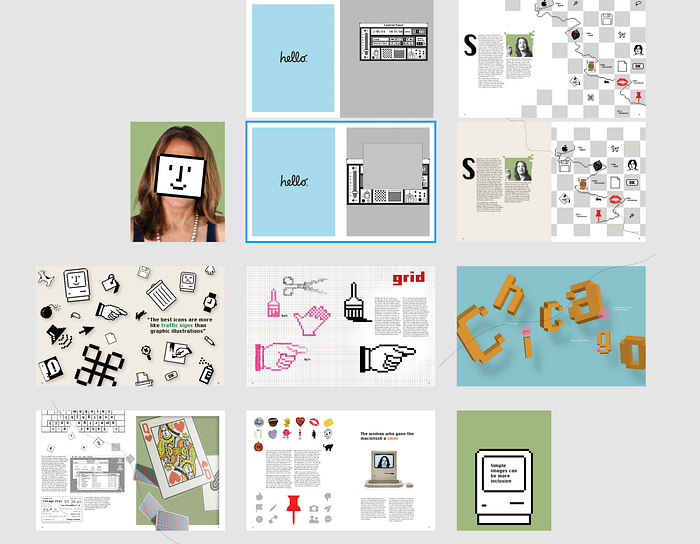
V1
Sketches
For the assignment, we were asked to create five different booklet ideas. This was extremely challenging for me to generate them. After the second one, I slowly ran out of ideas.


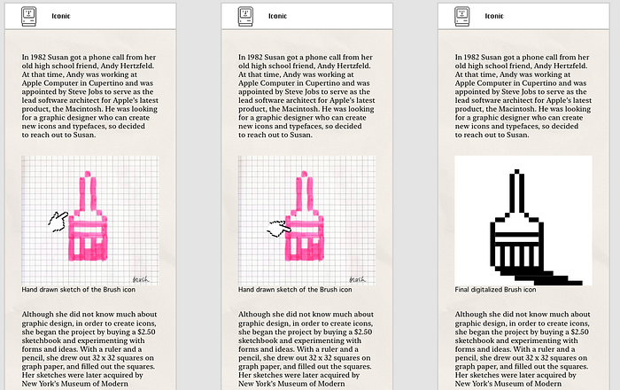
However, overall, I wanted to focus the booklet around her icons and typeface designs at Apple. For her icons, I thought it would be important to show how her work process by putting her initial hand sketches and comparing them to the final digitalized versions. I also included her projects done for Microsoft, Facebook, and Pinterest. I thought it was necessary to include her Microsoft solitaire project since she claimed that it was one of her favorite.
Feedback
I had a chance to meet with Brett and get some feedback
- Incorporate the falling effect? like how I did for the poster
- Likes the Chicago page and the idea of comparing her sketches and final
- None of them are perfect but mix and match the spreads
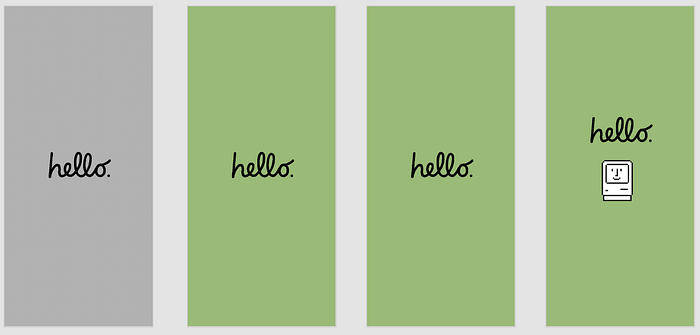
Cover
The cover was the first thing that I made when I started working in my computer. I’ve watched Kare’s talks on youtube, and each time she spoke about how being general could make everyone feel inclusive. Her icons, such as the happy mac and the exclamation mark, are supposed to be ambiguous so that people aren’t able to tell what gender or race they are. So my idea was to cover her face with the happy mac face to showcase the inclusivity.


Although I haven’t made the back cover yet, Brett told me that I should show her quote that would explain why I’m covering up her face with her icon.
3D Effect
For some of my spreads, I wanted to move out of the flat 2D screens. Although those were what she was well known for, I also wanted to add some “modernness” to them. In addition, Brett seemed to like how I made the icons and types on the poster to look like they are falling.
Although I was also worried making her work look 3D since that isn’t staying true to her ideas, I decided to move forward with it and created some visuals using Illustrator and Blender.


Spreads

To be hones, for some of the spreads, I didn’t have a clear idea of what I wanted to do.
Feedback
- Chicago spread is interesting
- Really likes the simplicity of the cover
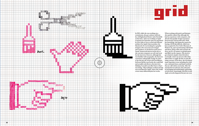
- Likes the paintbrush spread but decrease the size of them and put more pictures of her work to be more informative
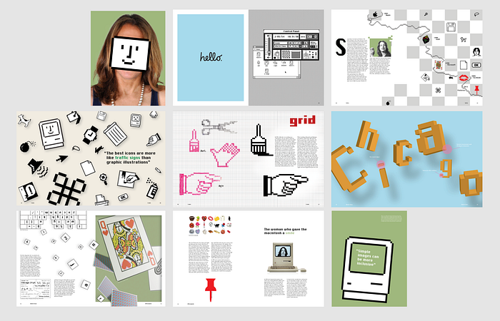
V2
Moving on, I decided to fix or get rid of the pages that I didn’t like. I also changed the order of the booklet as well. Originally, I was planning on showing her Apple icons, typefaces, Studio works, and Pinterest works. But for this version, I put an introduction to describe who she is, and then showed her Apple work. I also combined her studio and Pinterest works as well.
Timeline
Coming up with the timeline was a bit challenging for me. Originally I was planning on showing the timeline after showing her Apple works and making it run across multiple pages. However, I was finding it challenging to place her works in appropriate places. So I completely changed that idea and created a new timeline that shows up on just one page.


I took one of her works that showed her Apple icons in a checker box and replaced some of them with her icons made she made for other companies. To connect them, I recreated her lasso tool and applied it to the timeline.
Sketch/grid
In order to show more of her works and sketches, I reduced the sizes of the paintbrush. Here, I thought I could use the idea of the sketchbook and make the readers be able to actually flip through them. Although I definitely still have to work out the formatting and placing, I was able to get my basic idea down on the spread.


Spreads
There are still a lot to fix and create at this stage. I’m planning to remake the table of content and the “Aa” spread for the typeface. In addition, I definitely have to put more care into the back cover page.

I was also having trouble finding ways to consistently put the headings to some of the spreads. I liked how I put “Afterwards” on the solitaire card, but that only worked for that page.
Feedback
- Try playing with the grid for the sketch spread
- Add more icons and play with scale on the icon spread
- Bring in an actual photograph of the mac
- More consideration for the back cover
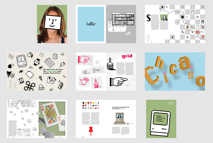
V3
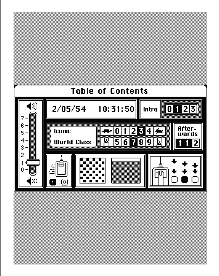
Table of Content
I decided to create a new page for the table of content since the first version didn’t seem interesting at all. I wanted it to reflect her work so I took the Mac control panel and added my own text to it. Although I liked the idea of actually turning her work into the table of content, I was also afraid that this could be too confusing.
Sketch/grid
Here, I used a grid paper to display her sketches so that the grid is more prominent.
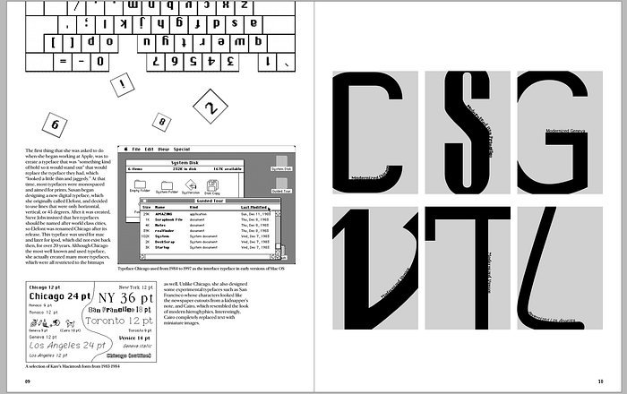
Typeface
I also wanted to change this spread because I wanted to show her typefaces in more detail. It felt like the “Aa” wasn’t enough to show her typefaces in her style.
Spreads
Not long before class, I realized that I had an extra spread because I don’t even know how to count. I have to kill two pages.
V4
First I condensed down the booklet so that it’s actually 16 pages instead of 18.
Some of my concerns at this stage were that the some of the spreads seemed too simple and weren’t dynamic enough. So I asked both Jaclyn and Hannah for feedback.
Feedback
- For the timeline, the icons can travel across the page to make it more dynamic
- The Chicago page should be the same blue as the Hello page
- I can try making the table of content more like windows
- Try playing more with the composition for the sketch spread
- For the back cover, I can use a punched out face of the Mac
- Icons feel too balanced on the icon spread
- Try fitting more virtual gifts on the facebook page and make them smaller
- The typeface spread feels too crowded
Spreads
Feedback from Brett and Andrew
- Add caption system!
V5
For this version, I mainly focused on adding the caption system to make the booklet more educational. I also tried some new things for the sketch spread. To give more tangible feeling, I printed out her sketches, wrinkled and scanned them.
Feedback
- Try making the background color for the sketch page black or some other color
Final


Mobile Experience
Sitemap

The experience is a similar flow as the booklet.
Wireframe
I was originally going to make it similar to my poster with the pixels.
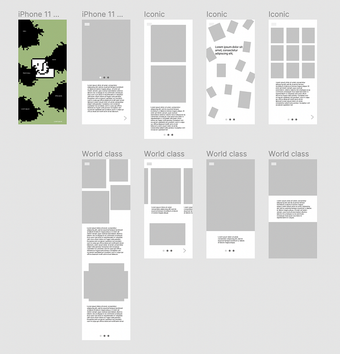
However, I decided to make the home screen simpler and resemble the original mac. Also although I created the upper wireframe, I mostly didn’t use it.
Changes
Although I made some pictures clickable in the app, I received feedback that it wasn’t clear for the users. So I added some movement to the elements. For example, I made some elements wiggle and added pointing icons on top of the clickable elements.
In addition, I was originally planning on making the menu bar resemble the original Mac menu bar. However, it was pointed out that it would be hard to use on phones. So I switched it to make it work more like a hamburger menu.


Lastly, I also planned on making the timeline pixel appear one by one. However, after testing it out, I realized that it takes too much time and can frustrate the users. So, although, I still added some animation, I simplified the steps so that the appearing of the timeline wouldn’t take too long yet still be interesting to see.
First timeline iteration
Second timeline iteration
Shifting down
After I tried adding some of the apple UI kits to the prototype, I realized that I needed to add space to the top. I ended up basically shifting everyone down on every single frame.


