Design Hero Project 3
Animation
Script + Music
I wanted my video to emphasize her view on simplicity and friendliness. So I gathered lines from these videos (link 1 & link 2) that focused around that topic. After creating an unpolished audio file, I started for searching for music. I found two possible music (audio 1 and audio 2) and created different audio versions for them. At the end, I decided that audio 2 file sounded more friendly and decided to make that my final version.
Script:
When I got to Apple, this advertising hadn’t been written but the prevailing thought was a group of programmers thought there could be a bit of a more humanistic side to computing. The idea just being a naive user could use it, and like games, it would be ideal to not have any manuals and it should be friendly. Andy also said, “well you know if you could just get some graph paper and with the smallest squares that you can, that’s what the job would be like.”
music
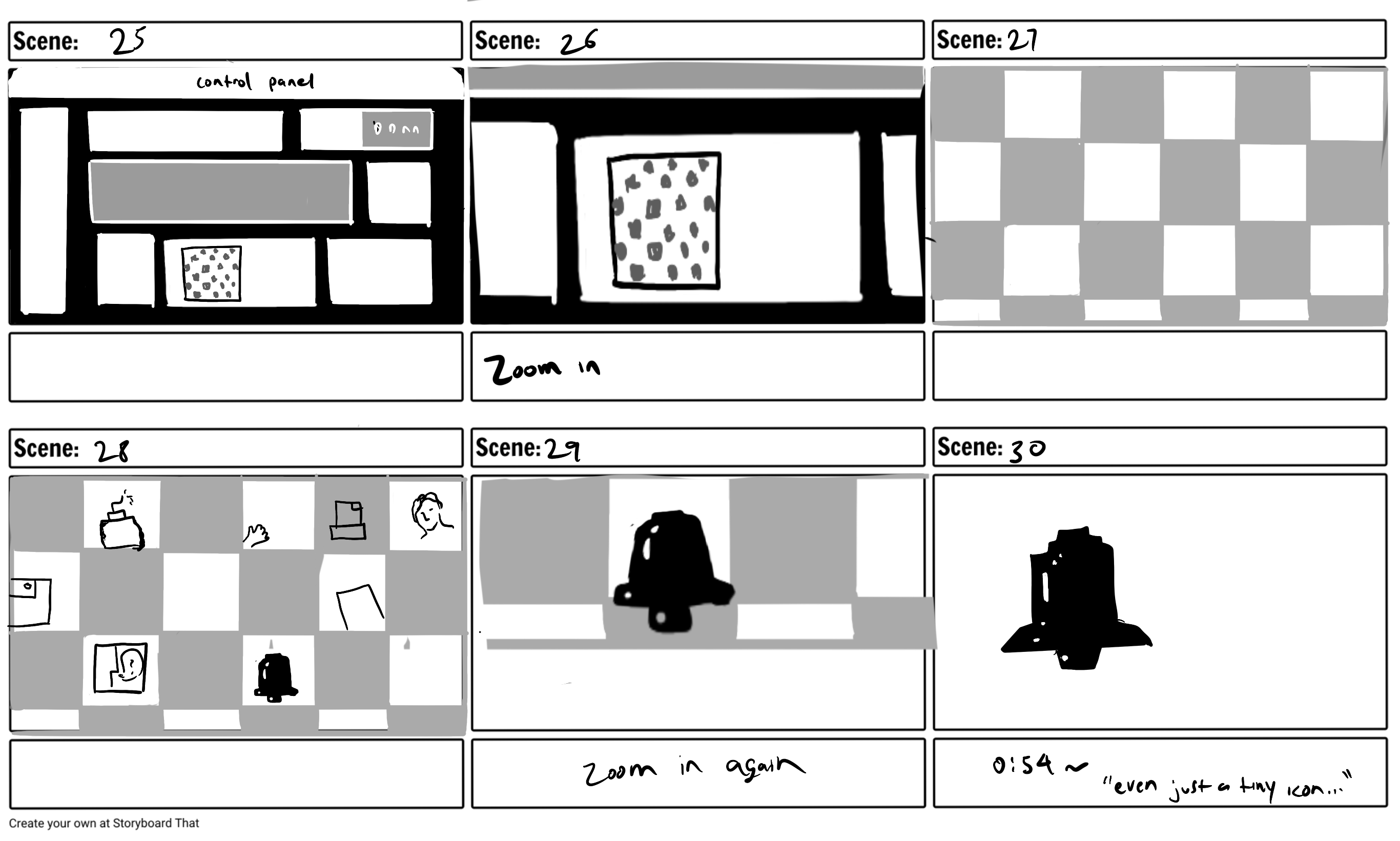
Even just a tiny icon there are a lot of considerations. What is it? What does it represent? Who’s it for? Where are they gonna see it? What is really the heart of the thing that needs a symbol?
music
One thing I always like to say, we all have this oddball, but a set of skills that you don’t necessarily think or are qualifications for something, but I think you just need to have confidence in what you can do.
Storyboard
After finishing up the audio file, I created a storyboard. I wanted the video to start off simple and as it goes on, I thought it could become more colorful and lively. I was also interested in adding animations to her icons so that I could bring life into them.


Inspiration
Because I didn’t think too much about the transitions for the storyboard, I began searching the internet for inspirations. I personally found this animation, which was shared by both Brett and my classmate, really helpful.
It 1
I wanted to start animating as quickly as possible in order to prevent myself from running out of time. So I jumped into animation without much preparation.
For the class on Tuesday, I was able to get the first 50 seconds.
I briefly talked to Brett after class on Tuesday. At this stage, there were some parts that I wasn’t satisfied with. For example, the paper flipping at 0:37 felt too unnatural. Overall, I was a bit worried that the whole thing might be too simple. However, Brett commented that the simplicity actually goes well with the designer’s style. He also suggested that the word box at 0:25 could be more conversation and not be exactly copying her word for word.
It 2
Before class on Tuesday, I met with Hannah to get some feedback on the process.
I asked her questions on how I could change the awkward paper flip during 0:37 ~ 0:38 and what she felt about the later part when I showed the typefaces. I felt really unsure about that scene because it felt too abrupt and disconnected so I wanted to hear about her opinion as well.
Feedback from Hannah
- The scene at 0:38 felt awkward because the paintbrush is digitalized but the paper is realistic
- For the typefaces, she didn’t know that those were names of the fonts so she suggested I could just show the letters without including the titles
- Also the transitions for the typefaces felt abrupt but it should be better once I change the format of it
- She liked the transitions during 0:57 ~ 1:05
For class on Tuesday, I didn’t get that much done but I decided to ask for more feedback on the video. He also said that the typeface transition wasn’t working for him but he seemed to like the video overall.
It 3
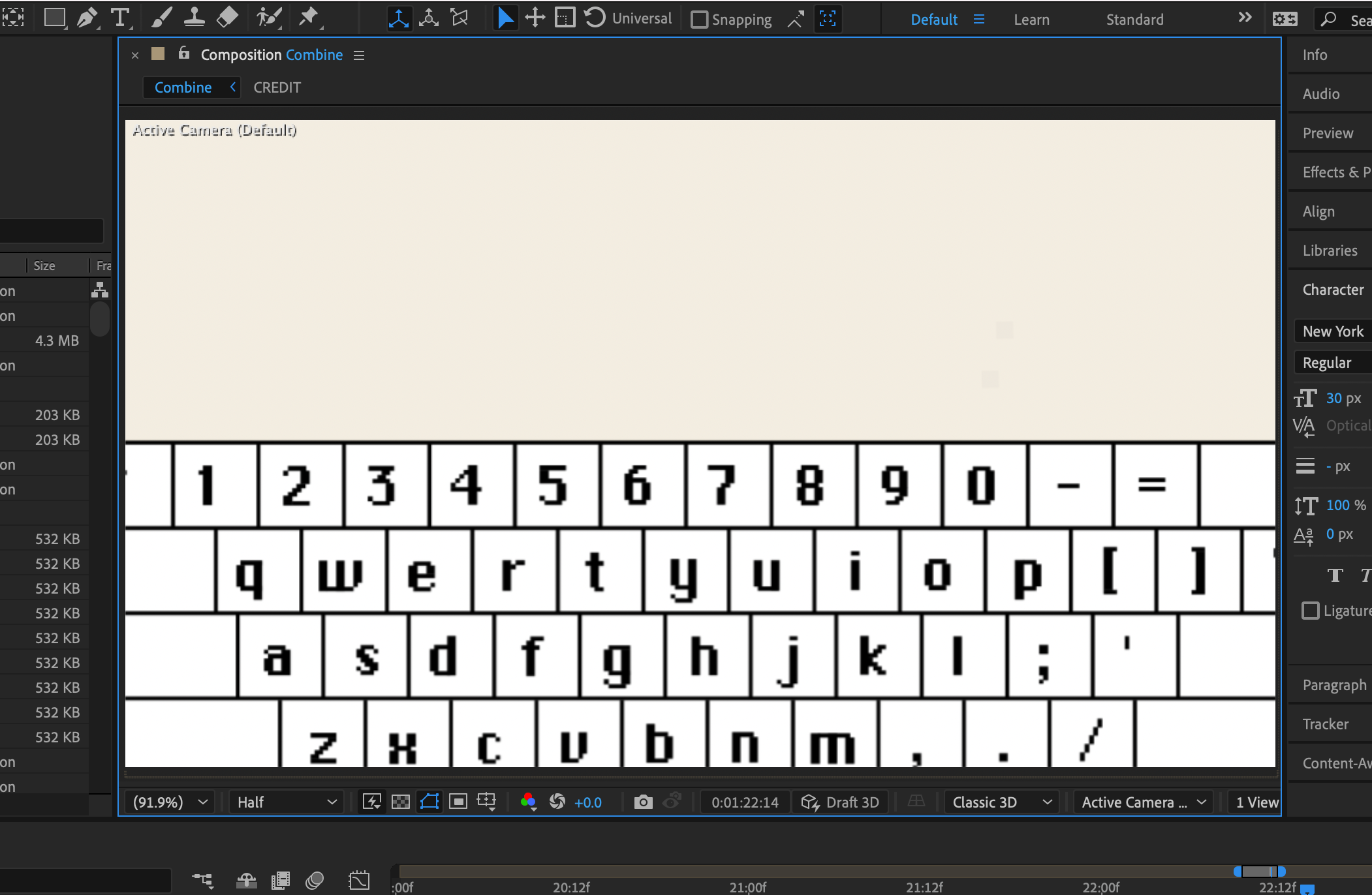
I knew that I had to change the typeface scene because no one liked it but I honestly didn’t know how I was going to change it. So I went back to the “On Type” animation, which is the inspo mentioned above, and I kept rewatching the video. I then realized that the airport display screen(?) at 0:55 reminded me of the Mac’s digital keyboard, which also uses the font Chicago.


I hope this counts as being inspired and not copying because if it is copying, then I’m just exposing myself here. I’m really sorry if this counts as plagiarizing,,,
Feedback from Jaclyn
- The word “symbol” at 1:08 felt too random and stayed on for too long
- Wish I spend more time showing her name at 0:45 before making it smaller so that people can consume the information better
Final Crit
For the final crit, I finished up the last part but I didn’t get to go over the details so I still had some work to do.
Feedback from Brett
- For the ending scene, find a new video where she actually moves
- Some scenes are blurry when zoomed in (0:15 ~ 0:18 and 1:19 ~ 1:21)
- Other than that pretty good
Feedback from Peers
- The muted colors at some scenes didn’t match well with the mood — for this comment, I realized that for some reason the colors seemed more muted when it was shown through zoom but I still admit that the colors are a bit too muted
- Some of the timing felt off
Final
I tried to resolve the issues mentioned above and some other detail problems that were found later on.
